Building Oak
A lot of people talk about how easy it is to build an app and earn big bucks. Now, I do agree that it’s now extremely easy to get to 60-80% of your idea. But, from my experience of building Oak — a mini productivity Mac app — the rest really is not that simple.
As a designer who has a very particular visual in mind, the last 20% can be grueling. There were moments I just wanted to yell at the AI or quit altogether. It was an infinite amount of back and forth to nail the core flow, handle edge cases, and get the UI and interactions exactly right.
Here, I want to share my entire journey — from a simple idea all the way to a launched product with over 40 paid users. Now, I know what you’re thinking:
40?! That’s like baby numbers lol
But hey - for someone who has never made money on the internet, I’m very happy that 40 random strangers paid for an app I built.
The intent of this article isn’t to discourage you from building. It’s about setting realistic expectations amidst the sea of Twitter BS like “It’s so easy to build a great product now and make it big.” But I do acknowledge this:
Maybe it’s pure skill diff lol, and that I’m not good at this.
Regardless, by sharing my setbacks and learnings, I hope you’ll learn how to build a better app than mine. Because trust me — there are moments where you want to quit. But there are also moments where you’ll feel unbelievably excited.
Because when someone uses something you built and tells you they love it, that feeling is truly unmatched.
So, let’s dive in.
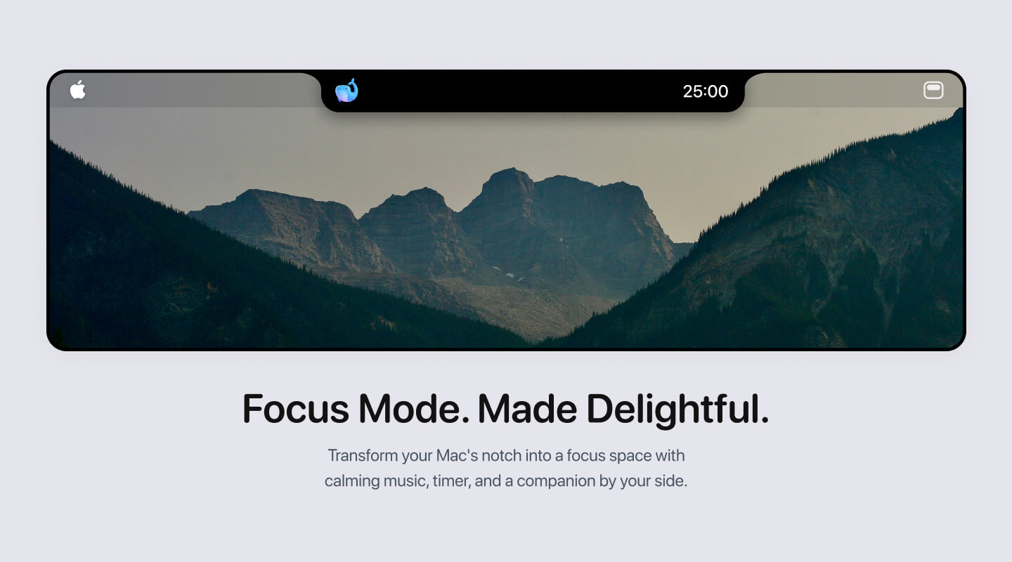
It all started with a simple idea
It all started with this line in my Notion back in July last year.
I vaguely had an idea for a productivity app that could live in my Mac notch. Inspired by projects like PixelPal, I wanted to combine that concept with a full suite of focus tools.
I had no idea if it was even possible. So I quickly tried to code up a native Mac app prototype using Cursor — and that’s when I hit my first roadblock.
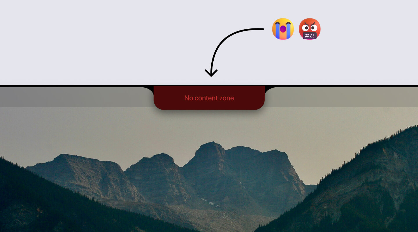
How in the world can I add something to the Mac notch?
Looking back, it’s so funny I couldn’t figure this out. But seriously, for the love of god, I just could not place things above the physical Mac notch. It was literally impossible.
After so much back and forth in Cursor, I started thinking:
Okay other Mac notch developers are probably just smarter than me. Maybe this is just not possible…
Then, after really studying other notch apps, I realized something obvious in hindsight:
They’re not placing things ON the Mac notch. They’re just making their Mac notch app longer in width and placing items on both sides. BRUH.
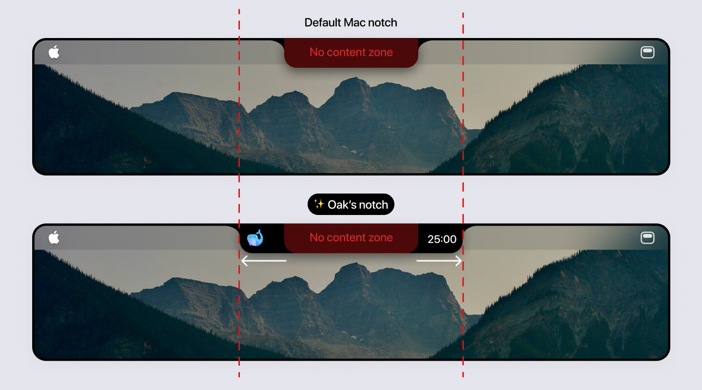
With that figured out, I saw a glimmer of light and started designing mocks in Figma.
Got the first prototype working
Then I started building out the core experience. Honestly, I don’t remember much from that period since it’s been so long — just a lot of:
- Waiting for Cursor to build
- Switching to Xcode → quit app → build app
- Repeat
Honestly, that workflow was mind-numbingly repetitive, and honestly part of why I started burning out on Mac app development at the time.
But, eventually after a few days of prompting, here was a video I sent to my friend Ian back in July 2025.
You can see that Oak had the core building blocks. But, if you look closely, the animations, alignment, and overall polish were all off. If I didn’t care about the details, I probably couldn’t just shipped it. But as a designer, I could not.
A short hiatus…
But after that initial rush build, I went on a hiatus. I can’t remember exactly why, but a few things potentially contributed.
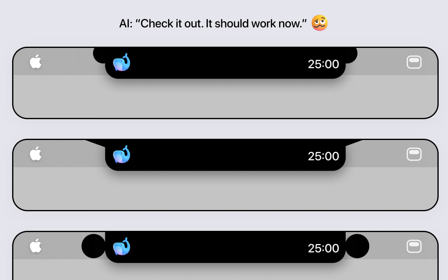
I could not get the stupid curve to work
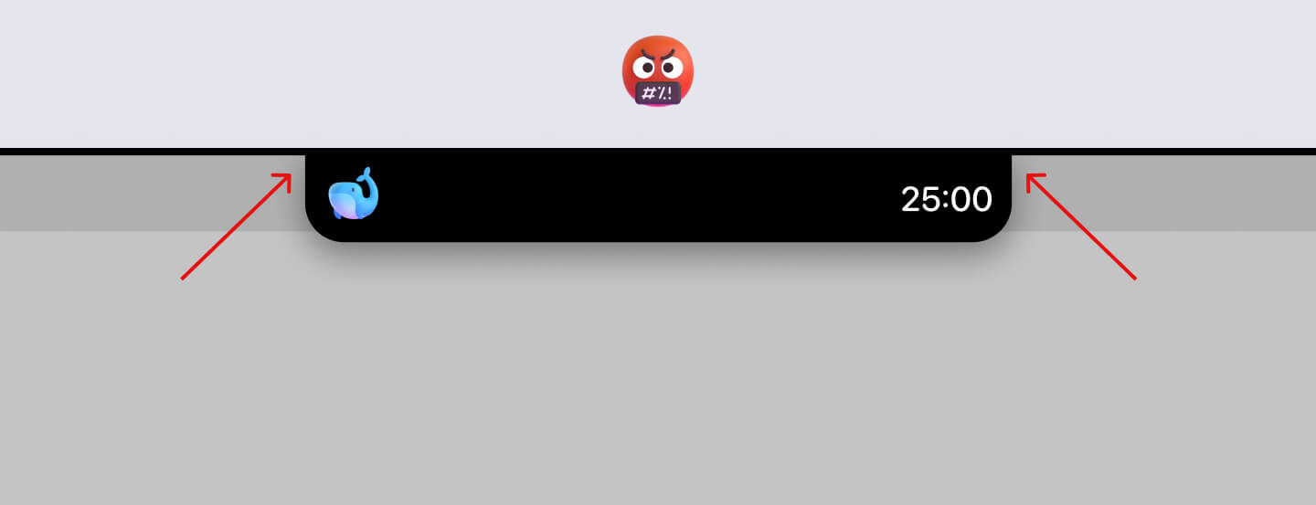
Notice how in the video, Oak didn’t have the curve into the top edge of the MacBook. It just cut in 90 degrees. I absolutely hated it, so I tried to fix it in the beginning.
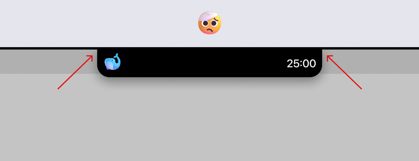
And holy moly. Claude just could not do it.
Now, this was before Sonnet 4.5. No matter how many times I prompted it, it just didn’t work. I would take screenshots, annotate them, type in ALL CAPS saying it failed again — repeat, repeat, and repeat.
Nothing worked.
It would either generate some weird curve or the same 90 degree cut. It was genuinely frustrating, and it made me realize how much harder it is to build Mac apps compared to the web. You can’t point at things like you can in a browser. And AI is bad at visual design.
Getting everything visually aligned was a huge pain
As I mentioned, the first version of Oak worked in theory, but my designer brain couldn’t accept it. Things were misaligned. Icons were flying during transitions.
Pre the “good” models, I could not get Oak to look the way I wanted. It was like shouting into a wall. After so much prompting, I became mentally exhausted. And when life got in the way, Oak slowly faded into the background.
Back and stronger from hiatus
A few months passed. It was now December 2025. I’d tried a few other mini projects in the meantime, but none of them led anywhere.
So, when I thought about what was next, I kept coming back to Oak. There was something playful, simple, and achievable about it. And with the new Sonnet 4.5 model everyone was raving about, I thought
Hey let’s give Oak another real shot.
One of the first things I tackled was that stupid curve.
At first, it still could not understand what I meant. But after multiple annotated screenshots and even browsing Codepen for web examples…
OH MY GOODNESS. IT CURVES IN!!!
Funnily enough, that day was one of the best days of building Oak. The pure struggle of trying to get something seemingly simple to work — and finally nailing it after so, so long — was an incredible feeling.
At this point, I was committed to make Oak a real deal.
Design: What I did to get Oak ready for launch
Rather than walking through specific features chronologically, I want to highlight the design details I’m most proud of.
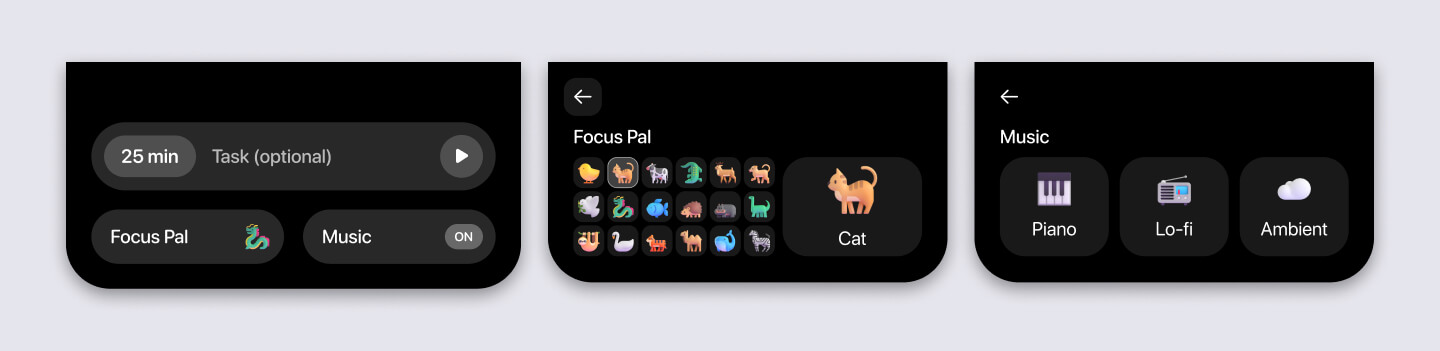
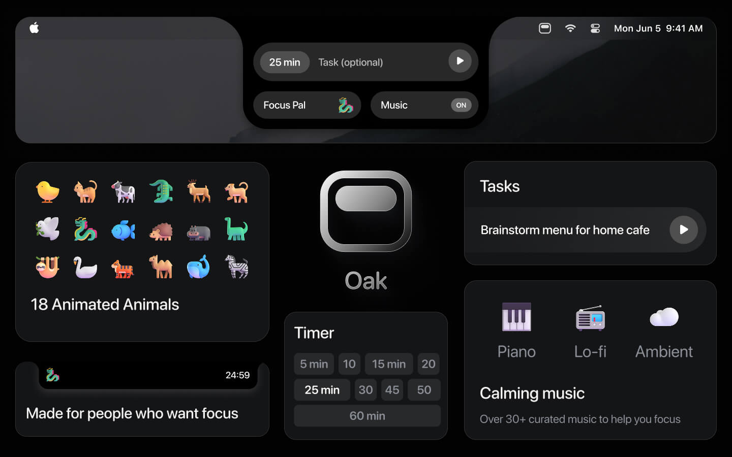
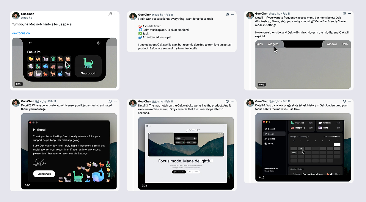
Timer selection
There are a million ways I could’ve designed this, but I was happy with where I landed: a simple 3×3 grid showing different durations.
A memorable onboarding experience
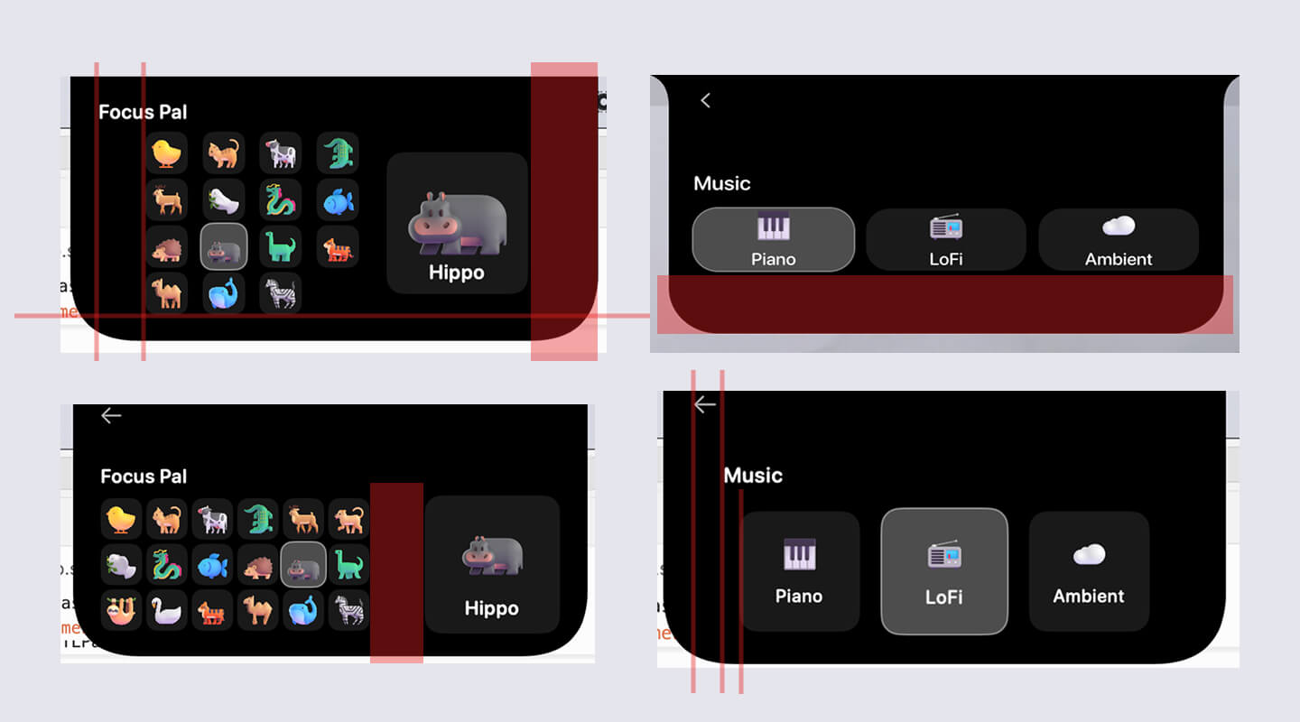
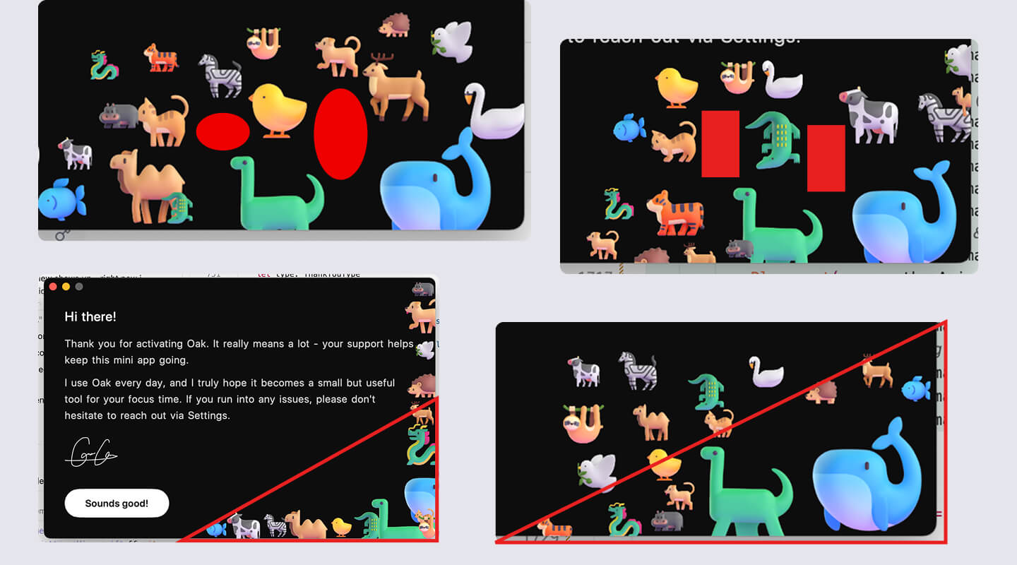
Largely inspired by Arc’s onboarding, I wanted Oak’s to be memorable with a personal touch. So I created a welcome screen in letter format, with an animated SVG signature and a gallery of the default focus pals.
Note: It took an ungodly amount of prompting to get the animals to align the way they do today. Below are some images of me annotating screenshots for Claude.
Collapse & expand animation
Inspired by Alcove, I wanted the transition between the collapsed and expanded notch to feel smooth. I spent a lot of time tweaking it. It’s not buttery smooth now, but I’m happy with where it is.
One really annoying bug initially: the two curves into the top edge were actually separate shapes from the main Oak body. So when Oak collapsed, you’d briefly see the ears detach — which was jarring.
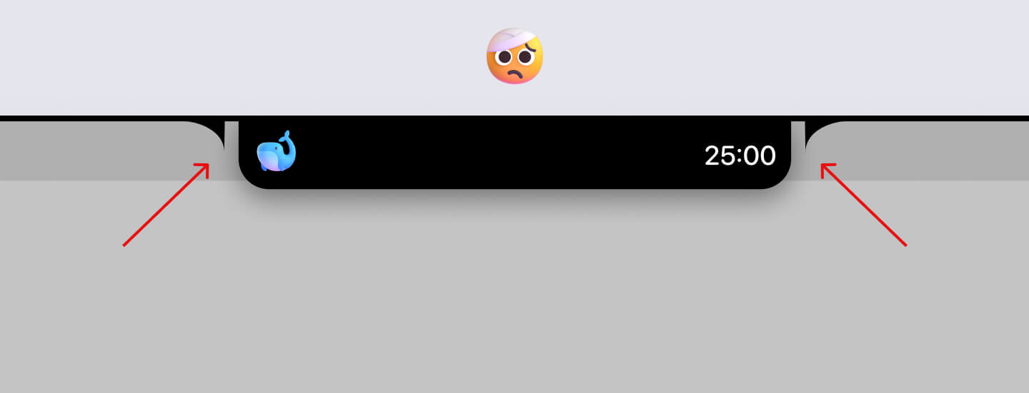
I didn’t understand why it was happening at first, so it took a lot of effort to understand how Claude had built it before I could propose merging everything into one unified shape.
Usage page in settings
Something I’ve always wanted in a focus tool is a usage history. It started with Figma designs, then got built out as a tab within Settings.
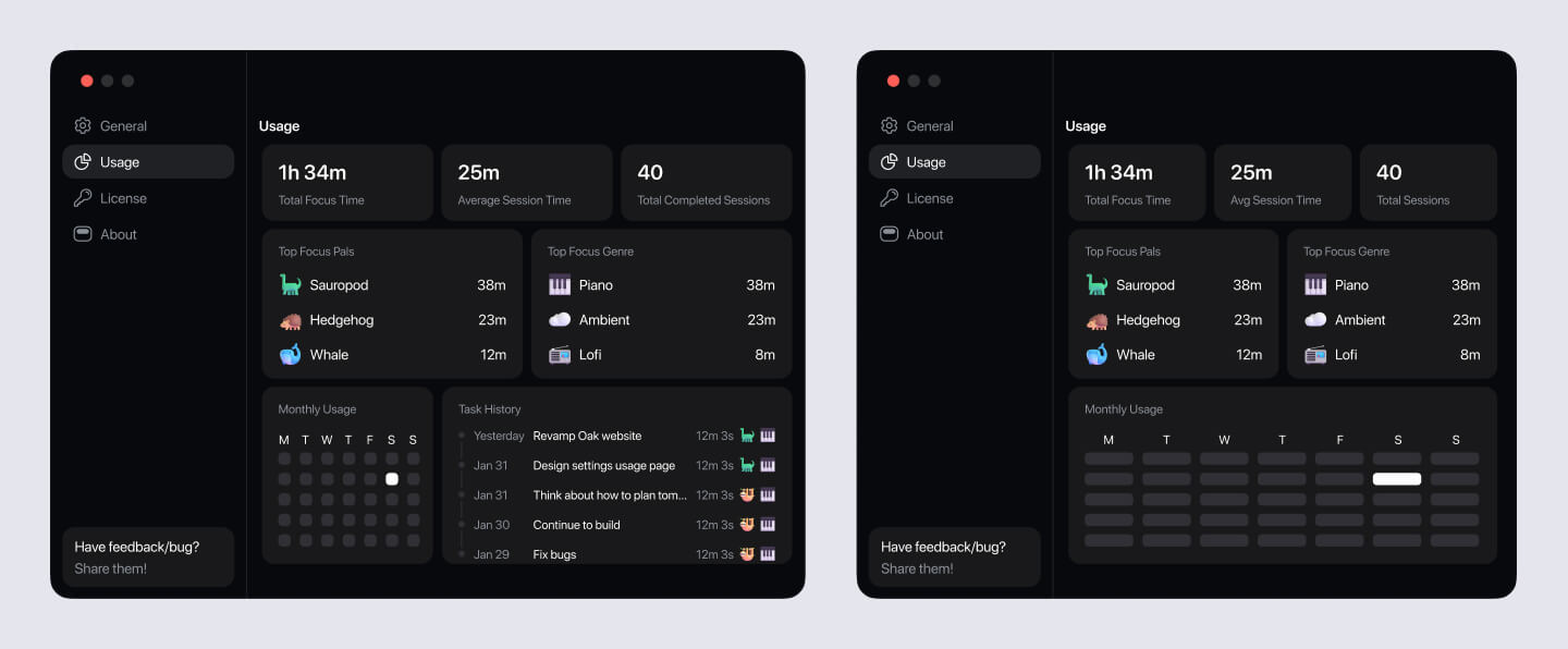
One of my favorite parts about the usage page is the Monthly Usage section. It’s very much inspired by GitHub’s history, and when you hover, you can see the specific time spent focusing that day.
Another favorite of mine is the task history section. Users can see each task’s name, duration, focus pal, and the music genre they had on during the session.
Menu bar friendly mode
Oak was blocking access to menu bar items sitting beneath it. So, the solution I came up with is “Menu Bar Friendly” mode. Once toggled on, when user hovers from the side of Oak, it’ll shrink to show the menu bar item underneath.
DWG page
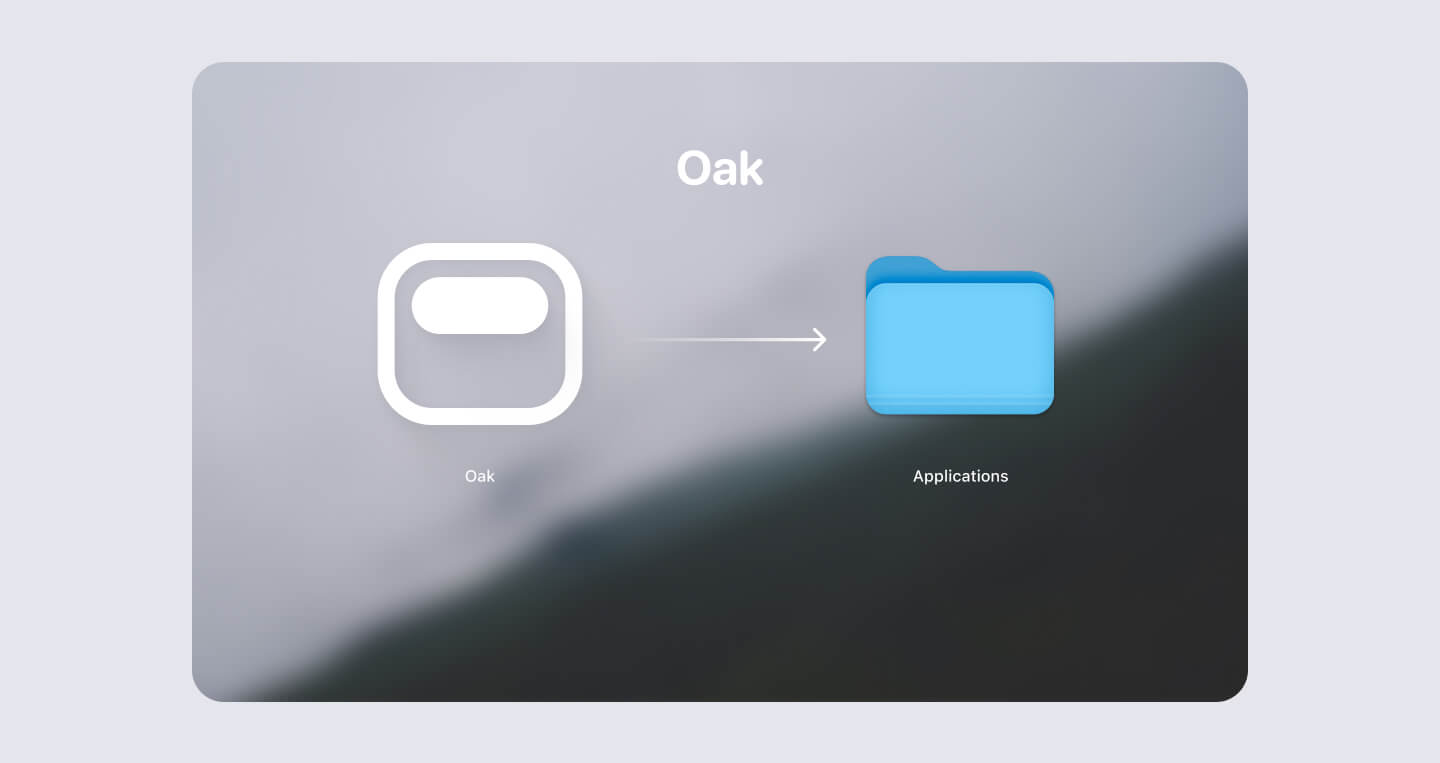
I designed the installation screen when user first opens Oak. Something I didn’t know I need to design in the beginning.
Oak website
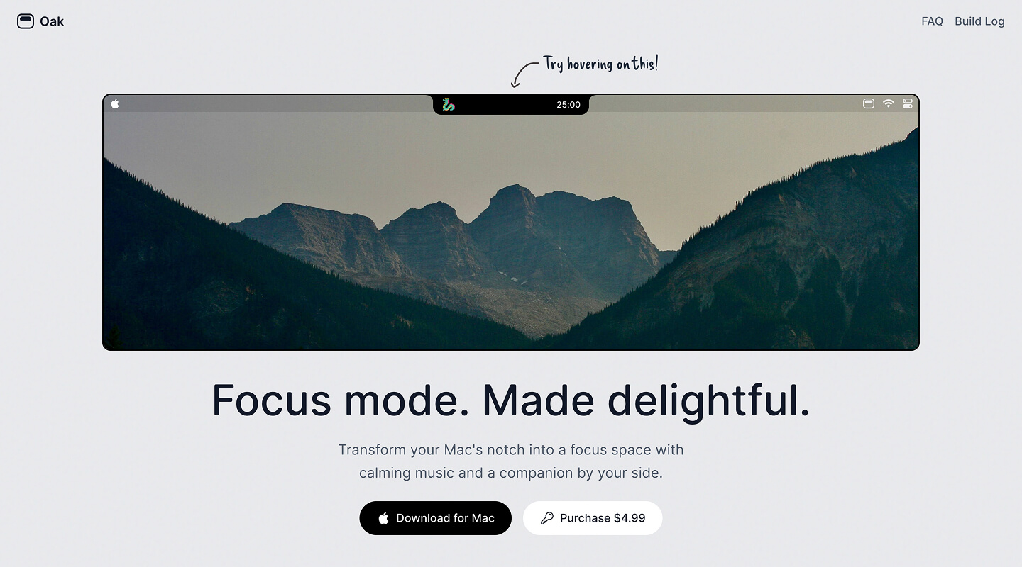
Most product websites use GIFs or videos to showcase their app. But I wanted to do something different for Oak:
What if I just rebuilt Oak directly in the browser? A video can do the job, but a product feels most trustworthy when you can actually try it yourself.
So that’s what I did. I rebuilt Oak’s core functionality on the website — with a caveat: If you start a timer, it’ll reset after 10 seconds and shows a toast prompting you to download. I didn’t forget about that edge case.
I was also proud that it works seamlessly on mobile. Instead of hover, you can tap Oak and it’ll behave the same way.
For the aesthetic, I wanted the site to feel calm and still — the way you feel when you’re focused. So I chose a light gray background and a mountain image from Unsplash (shoutout to Max Man) to create that mood.
When I first launched, the site was deliberately minimal:
- An interactive demo
- FAQ
That’s it. I thought about adding a feature gallery, but dismissed it — I wanted to keep things simple. I added it eventually post-launch.
After making sure all the links worked, the website was ready to go!
Non-Design: What I did to get Oak ready for launch
Woah - You thought I was gonna go straight to launch day?
Not so fast. If there’s one thing I learned building a product solo, it’s that there are so, so many non-design decisions that matter just as much. I’ll walk through each one.
Why I didn’t put Oak on the App Store
I made this decision pretty early on:
- The App Store takes ~30% (15% for small developers). For a small app like Oak, that’s a meaningful cut.
- Every release requires review. As an indie developer who wants to iterate fast, waiting wasn’t an option.
- Most Mac notch apps aren’t on the App Store either — Alcove, NotchNook, Notchflow.
This said, there are real benefits to put your app on the App Store:
- Discovery is significantly better through App Store listings.
- Release builds are handled automatically — which is honestly the biggest perk. More on why that matters below.
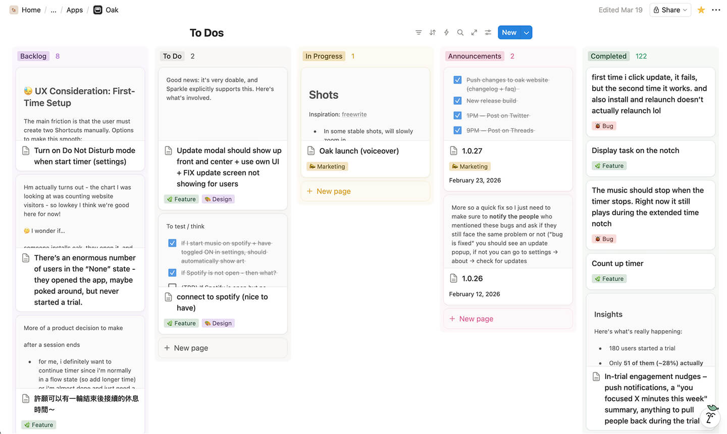
How I managed my tasks
I use Notion’s Kanban board. It was simple to use and motivating to see the number of Completed task go up each day.
How I got my music
I tried to find royalty-free music first, but had no luck. So, I subscribed to Epidemic Sound, which gave me access to a massive library of quality tracks.
I hand-picked every song and organized them into genre folders. Since Epidemic Sound files are WAV, I wrote a quick script to convert them to MP3.
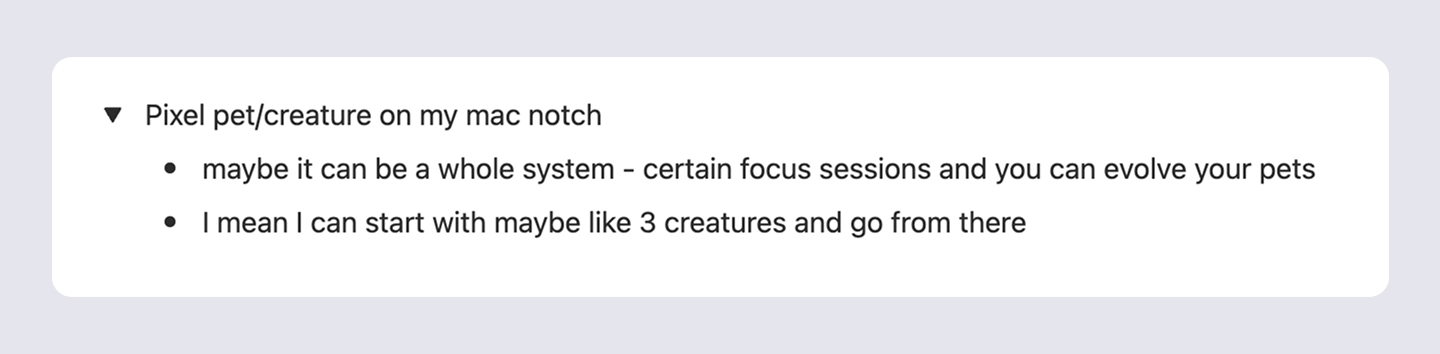
Where are the default focus pals from?
I’ve always been a huge fan of Microsoft’s fluent emoji.
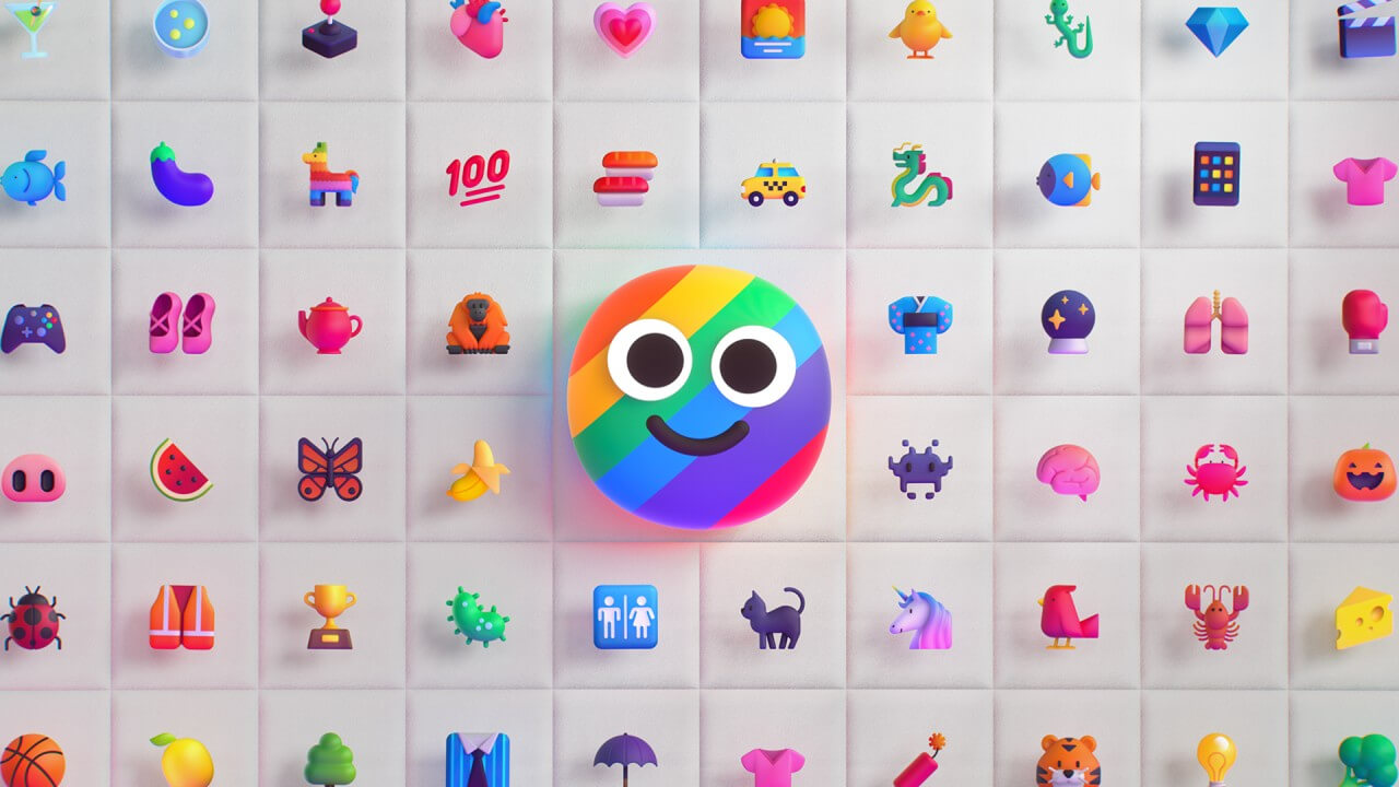
The downside: They’re static. So, I got really excited when I found an incredible library of animated fluent emoji curated by @oxyzen. The animated emojis brought so much life to Oak, and I’m very satisfied with this starting set of focus pals.
How I set up release for Oak (a nightmare)
This was undoubtedly the most frustrating part of building Oak. And honestly, to this day, I feel like there are lingering issues.
For context, because Oak is not on the App Store, I needed to handle updates manually. Without a proper update mechanism, I could ship a new version and existing users would never know.
After research, I found Sparkle, an open source update framework for MacOS apps. Looking back, I still think this is the best option to use. But, for whatever reason, Claude was not trained on this at all, which led to a universe of problems.
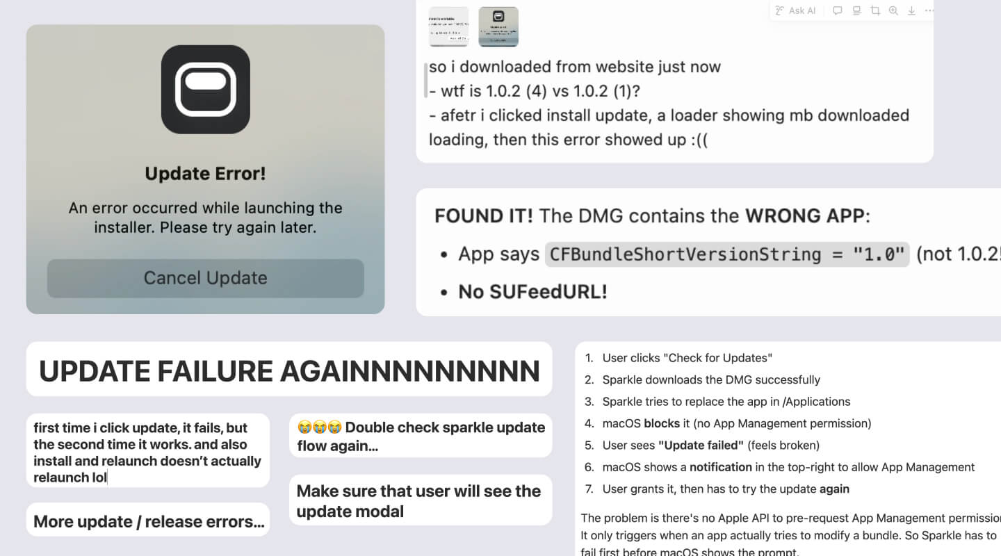
Honestly, instead of me listing every issue I faced with Sparkle, I’ll share the rule file I built from weeks of frustration and internal screaming. It’s a comprehensive checklist that ensures when I type release {version}, it just works — updates the build, updates the download button on the website, and prompts existing users to update.
You can download the markdown file here. I haven’t had a major Sparkle issue since.
God bless you if you’re working with Sparkle.
Where do I store data
Building Oak taught me a lot about storage. Since session data lives locally on each user’s device, what I needed to store were two other things:
- Music - When you download Oak, there will be 15 songs per genre that comes within the app. But when I wanted to add more, I realized a problem: Bundling more tracks would dramatically increase the app size. Thus, I decided to do 15 songs in app and 10 additional on the cloud that loads once you open the app without increasing the app size.
- Release builds - Remember we talked about Sparkle release build? How it works is that each new release build has a number that increments up. So if the current release build is 1.0.31, then the next one could be 1.0.32. But I need somewhere to host these files and ensure the website’s download button always points to the latest build.
With those requirements in mind, I began exploring different storage options.
Vercel blob storage
It worked for the first few release builds, but then I quickly hit the free plan limit. With the pro plan being $20 per month, I quickly looked for an alternative.
GitHub releases
The next one I tried was GitHub releases, which is free with unlimited storage. It worked great until a friend told me that downloading Oak took like over one minute. That was when I learned about CDN - content delivery network.
You can think of CDN as little towers stationed in different places around the world. The benefit of CDN is that no matter where the user is, they can download from the closest tower. And that closer distance equals faster download speed.
The problem with GitHub releases is that it didn’t have CDN. So that led to an incredibly slow download speed.
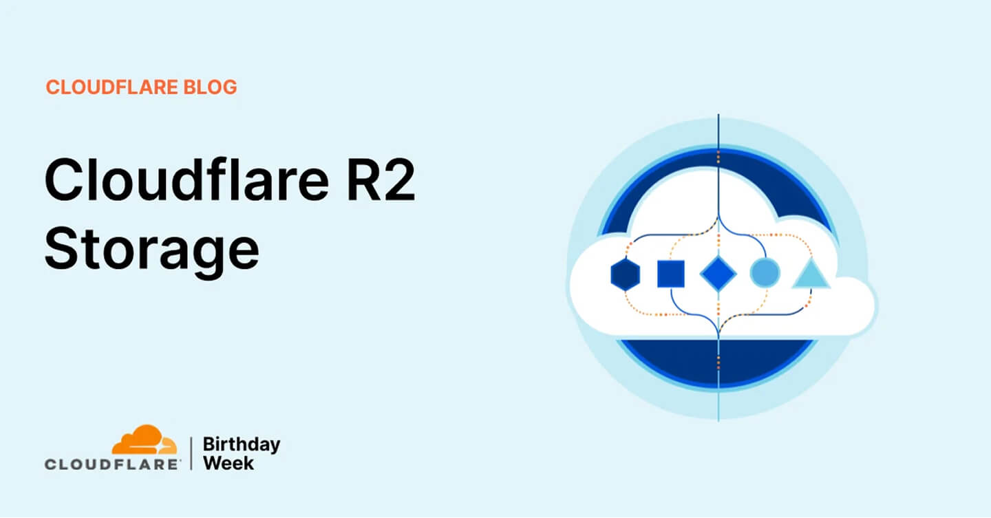
Final and current: CloudFlare R2 Storage
Eventually I landed on Cloudflare R2 storage, which not only has CDN, but also offers an incredibly generous free tier. This is where I store both music files and release builds now.
No more Xcode
Remember that brutal Cursor ↔ Xcode workflow I mentioned?
Well, one day I realized that I didn’t need to touch XCode because I can actually access it via the terminal in Cursor. Maybe that’s different if I want to launch on the App Store though.
In the rule file I mentioned above, I have it set up so that whenever a code change is made, it automatically kills the current dev build, rebuilds, and opens the new one for testing. This has saved me so, so many manual clicks.
How I collect feedback
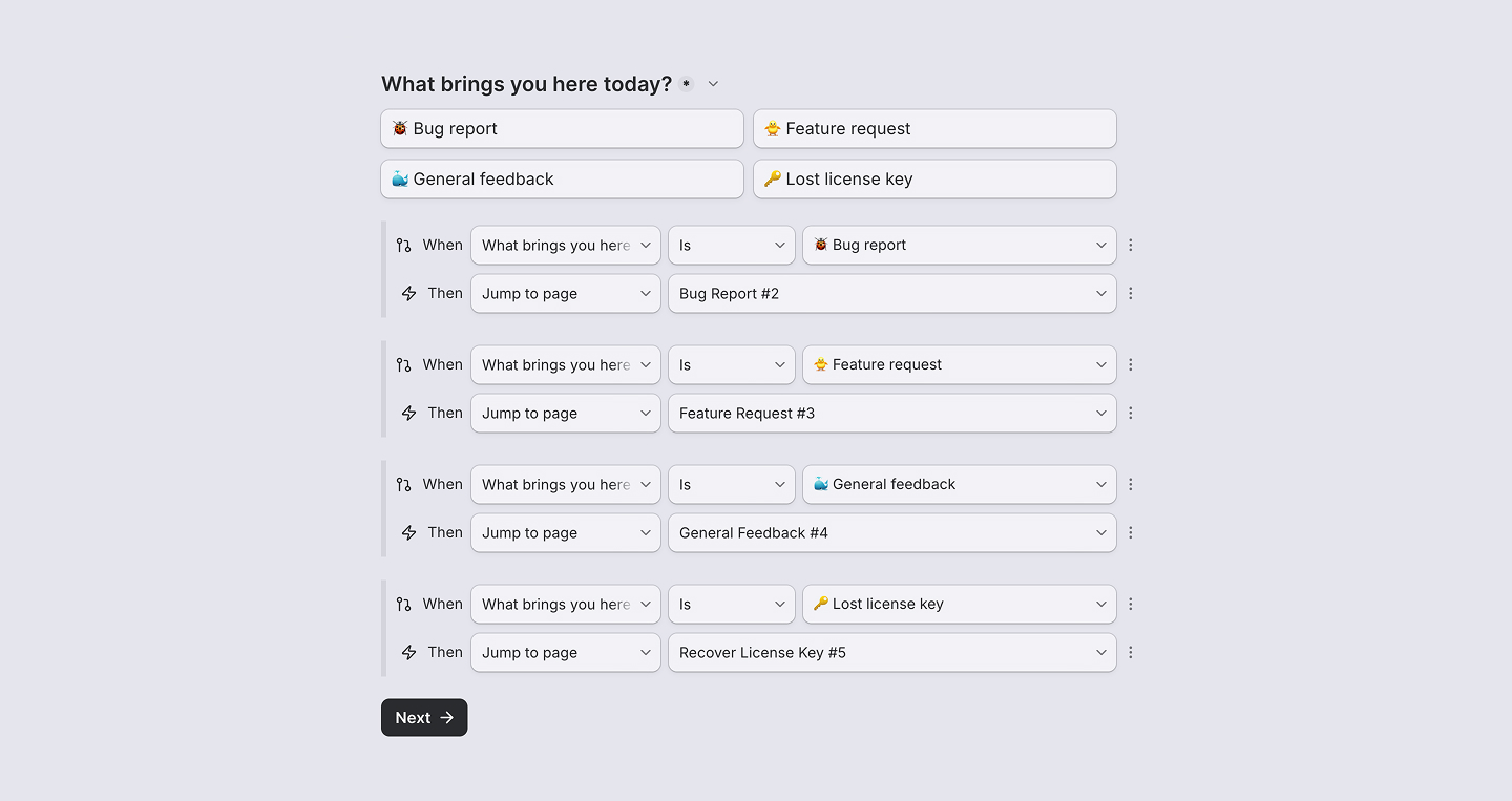
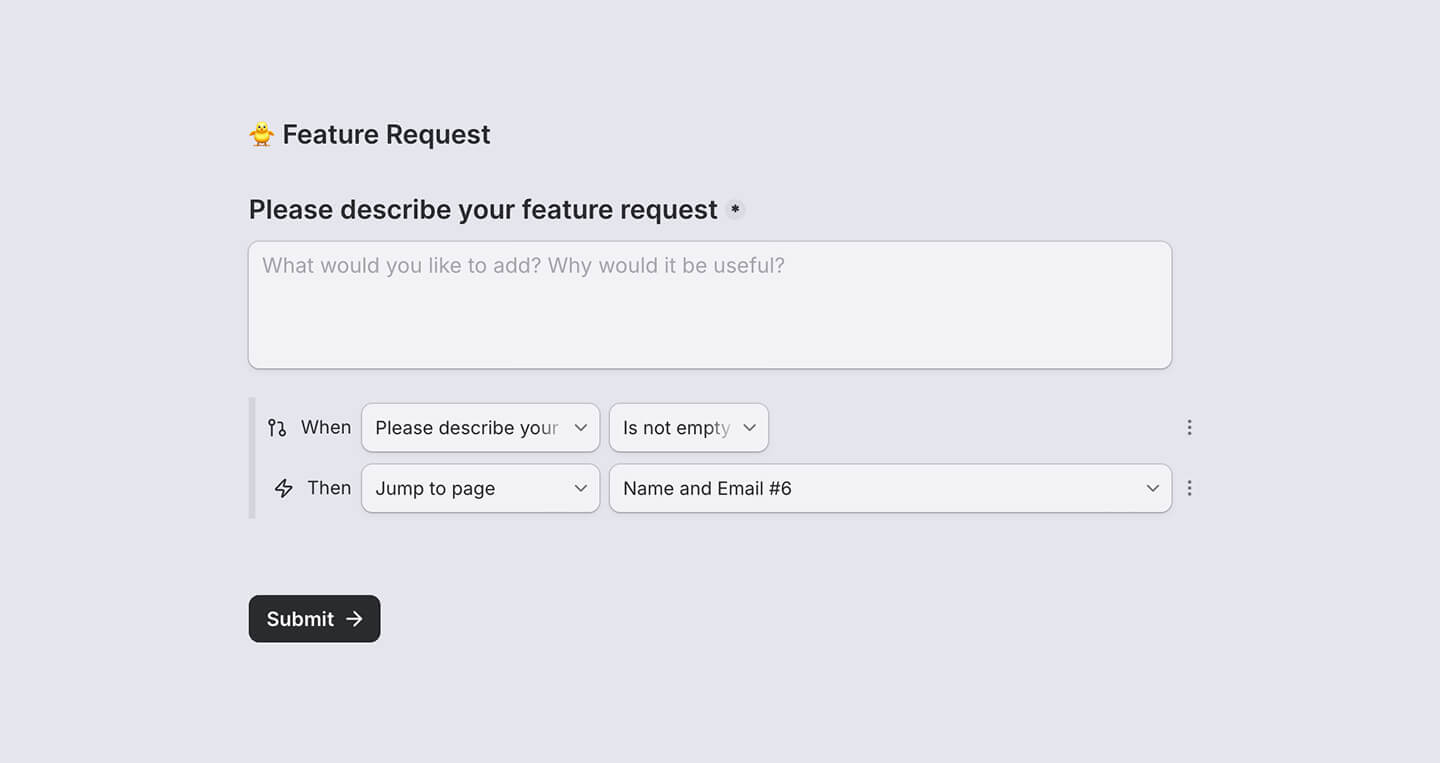
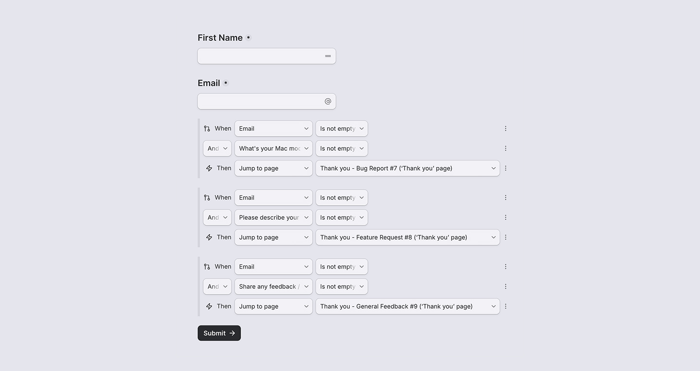
I’m using Tally. I’ve been following their building journey for a while, and they’re one of my favorite indie products.
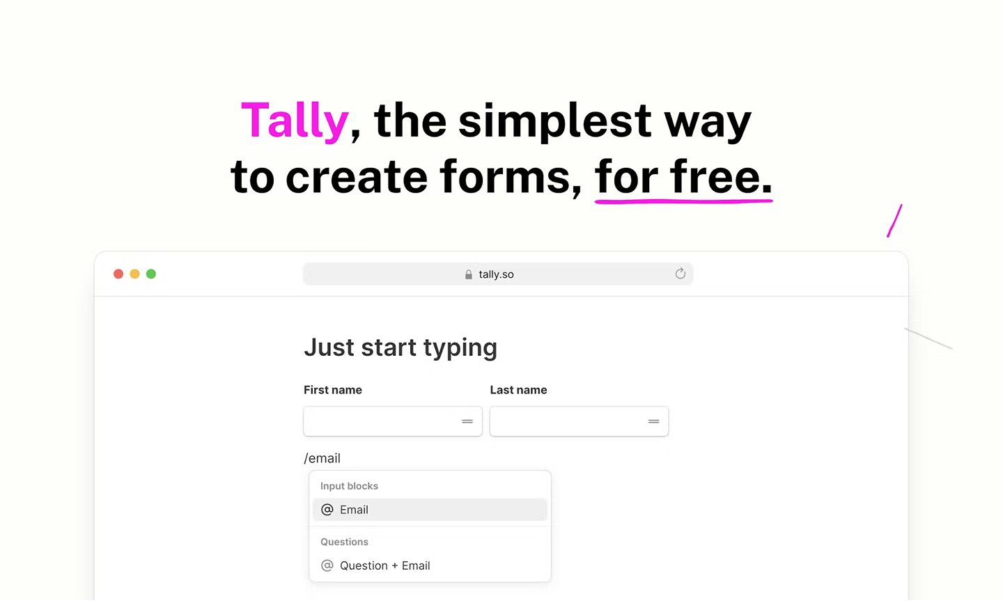
Small note though: Building a multi-page form in Tally was surprisingly frustrating. I eventually got it to work by stringing together conditional statements. Below are screenshots of what that looks like, and hopefully those can be good references.
Dashboard to track metrics
I use Posthog, also one of my favorite products, to track Oak’s usage. I could probably write an entire article about tracking success metrics, but in short, the key metrics I tracked are as follows.
Week 1 Retention
Of users who launched Oak for the first time in a given week, how many came back to start a timer the following week.
I learned this from Chris Raroque’s video, and he’s been a huge inspiration. Would highly recommend his videos if you’re building as well.
DAU (Daily Active User)
For DAU, I track two types:
- App open in the background: Since Oak is a background app, I added an app_heartbeat event that fires every 15 minutes if Oak is open.
- Timer started: This is the primary metric I look at since Oak is a productivity focus app.
Onboarding Funnel
Full top-of-funnel conversion: how many users who launched the app went on to start a trial, and how many trialists activated a license. This helped me identify drop-off points and improve accordingly.
A lot of this was figured out through conversations with PostHog AI. It’s actually genuinely good at brainstorming metrics, identifying events to track, and creating insights directly in dashboards.
How I decided on $4.99 & payment
At first, I wasn’t sure if I should charge for Oak at all.
I mean… It’s a mini focus app. Would people really pay for this…? Would they think I’m being greedy?
A lot of self doubts and uncertainty. But, I eventually landed on 4.99 for a few reasons:
- Most Mac notch apps charge significantly more — ranging from $13 to $60. Yep, you read it right - $60. Suddenly, $4.99 felt reasonable.
- The Y Combinator advice kept ringing in my head: “If users won’t pay for your product, you don’t have a viable business.” Plus, I’d always wanted to build something people would actually pay for. That was one of my biggest “what if” from Inko Cat, where we built something good but never charged for it.
Now, for the payment service, I knew that Stripe was the industry default for apps. But, I wanted to try something new. And so I went with a product I’ve been following for awhile as well: Polar.
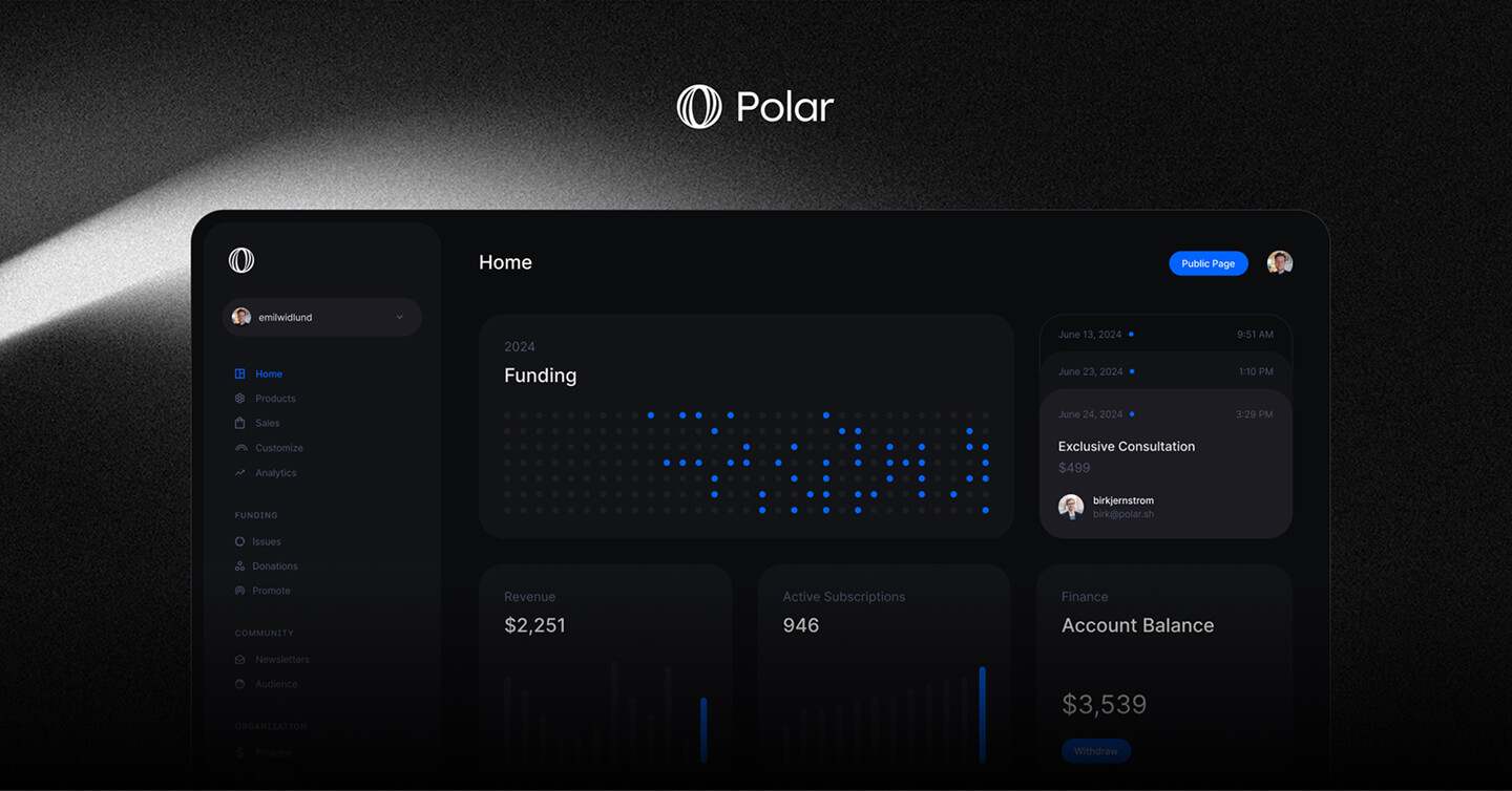
After hearing my brother’s recent frustration with Stripe’s product complexity, I do not regret using Polar a single bit. In fact, it’s an incredibly well-made product with a refined UI, and I would highly recommend checking it out. I also designed the main product graphic to display on Polar.
It was also easy to set up a license system as well. And I just had to make sure to build the logic in Oak to verify the license and keep track of the trial period.
Beta testing
With all the core pieces in place, I took the first nerve-racking step to share Oak to the world. Well, not to everyone, but to my friends first.
I sent the Oak website and a 100% discount code to 6 people. Huge shoutout to Ariya, Heng, Ian, Temi, Jason and Allen for testing Oak and giving great feedback.
My main advice for beta testing:
When someone gives you feedback, accept it, say thank you, and fix it right away.
It’s simple as that, but it requires a level of focus, urgency, and humbleness (to not get defensive).
Launch marketing plan
While beta testing, I settled on two launch channels:
- Twitter - Supportive of indie builders and with the right reposts, it’s possible to get a decent reach.
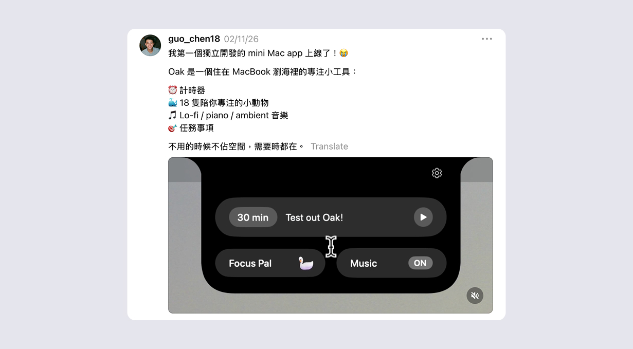
- Threads - More tailored to the Taiwanese community, so my post here would be in Mandarin.
I considered Reddit and Instagram, but quickly dismissed them — too much effort to build an audience or shoot content from scratch.
After many iterations, I finalized the messaging for both platforms.
Launch day & results
Let’s get straight to it.
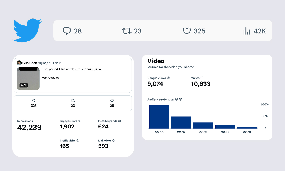
Twitter post had a very slow start, which had me worried.
Wow… After this much work, this is it?
Thankfully, my friend Ian stepped in by liking and reposting it. And from there on, the views started going up. And I was really happy with the result.
One lesson: Don’t put links in the main post (thread is okay). Social platforms deprioritize posts with external links.
Threads
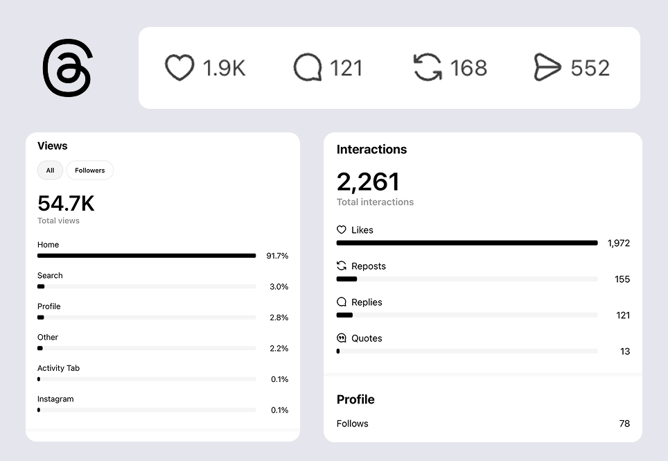
Threads completely blew me away. It went mini-viral in the Taiwanese community. It not only had more views than Twitter, but it had almost 2,000 likes.
Combined across both platforms, Oak’s launch hit around 95K views. I’m very happy about that.
Then, what happened post launch?
An insanely low conversion rate
Wait…? But didn’t you say you have 40 paid users…? That doesn’t make sense considering you had ~95K views…. That’s like a 0.0004% conversion rate.
I know. It’s terrible. And this was my first real taste of how hard conversion actually is.
It also didn’t help that I discovered a major bug post launch: For some users, Oak was still usable after the trial expired. I fixed it quickly, but the damage was likely already done. Not great.
Now, don’t get me wrong. I’m incredibly grateful for every one of those 40 paid users. And I’ve been building steadily to improve that conversion rate.
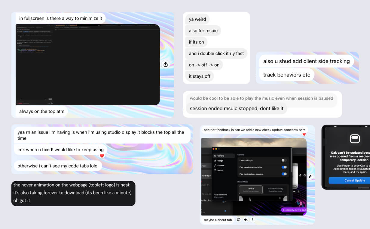
Fixing an flood of bugs
As a designer, you rarely experience firsthand what it’s like to get hit with app bugs — let alone having to fix them yourself. Launch week was my crash course in exactly that - customer support.
On one hand, it’s a blessing that people send feedback because that means they care. On the other hand, it’s stressful because I don’t want users to use Oak with a ton of bugs.
So, for the first few days, I was nonstop: fix a bug, release a new build, repeat. I was on a constant email chain with one paid user who was running into issue after issue. Shoutout to her for being patient and generous with her feedback. Eventually I fixed everything, but it was stressful.
My advice, that’s honestly the same as beta testing: In the first days after launch, when someone gets a bug or gives valuable feedback, fix it immediately. The quick turnaround builds trust and stabilizes your product faster.
Shipped new features post launch
Beyond bug fixes post launch, I’ve shipped a bunch of improvements. Here are the highlights:
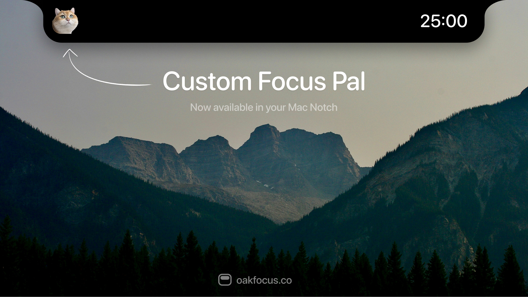
Custom focus pal
The most requested feature from users. You can now add a custom focus pal in Oak. Getting a Finder window to open when clicking “+” was a surprisingly painful problem — even Peter Steinberg (creator of OpenClaw) wrote about how frustrating it was here. We got it working eventually.
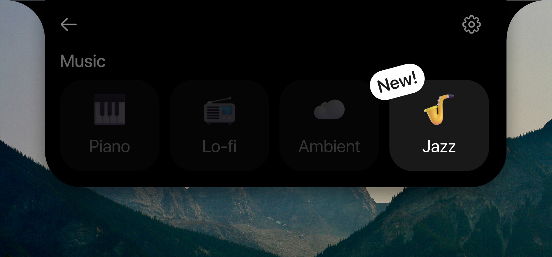
Jazz
A popular request from users. Jazz is now a music option in Oak.
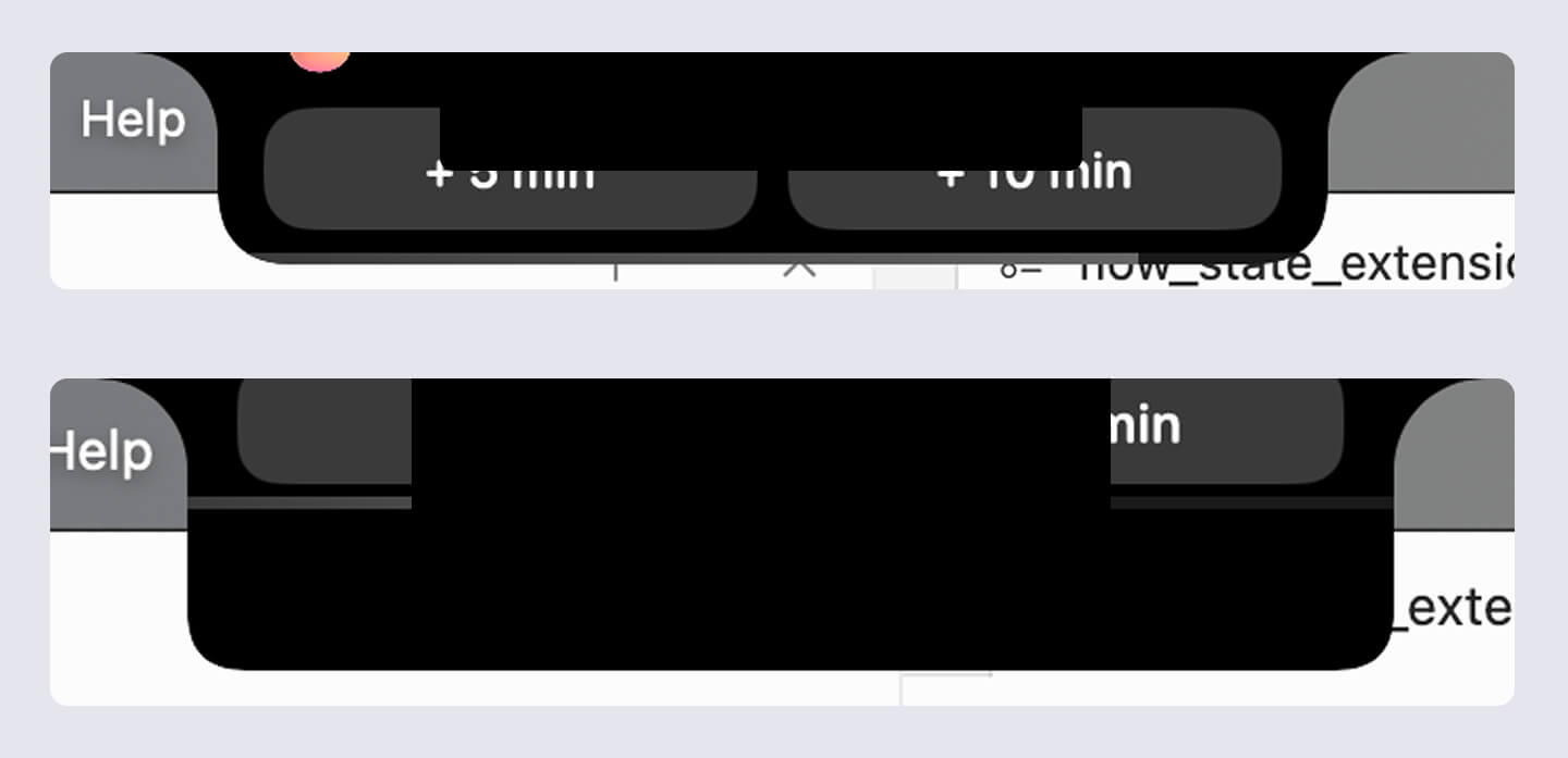
Flow state extension
One of my favorite features. When a session ends, an expanded notch now asks if you want to add more time to stay in flow.
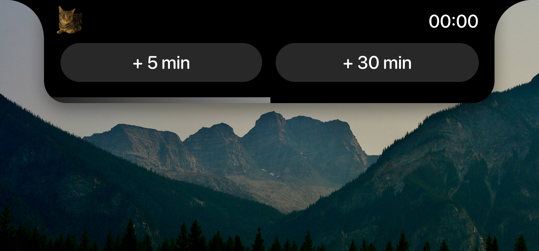
It was especially tricky to get this feature right. Below are screenshots of past attempts.
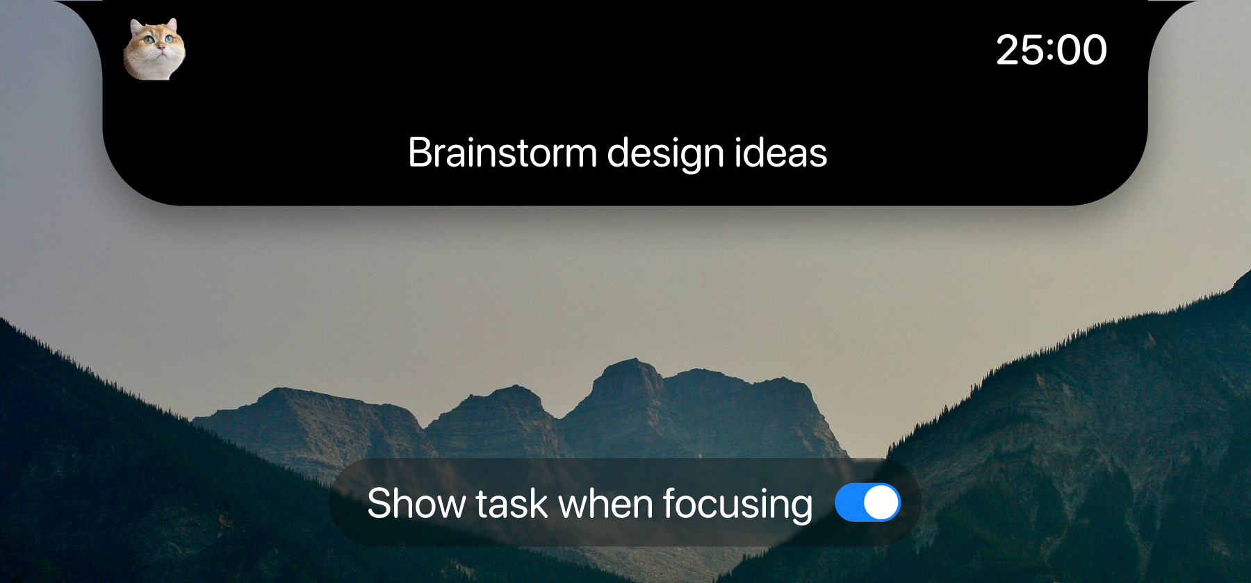
Show task during session
You can now display your task name during a session. In terms of the task positioning, since nothing can physically sit on top of the notch, so placement had to be below it.
Wait but what if there’s tabs under?
I tried to solve it: Hovering over the task area collapses it so you can still access the tabs below. There’s still the visibility problem, but at the moment, this is the best I can do given the constraints.
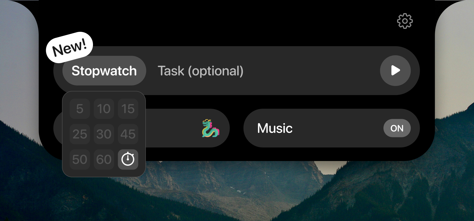
Stopwatch mode
Instead of counting down, you can now count up — useful when you’re not sure how long something will take.
Website feature gallery
Long overdue. I added an interactive feature gallery on the website.
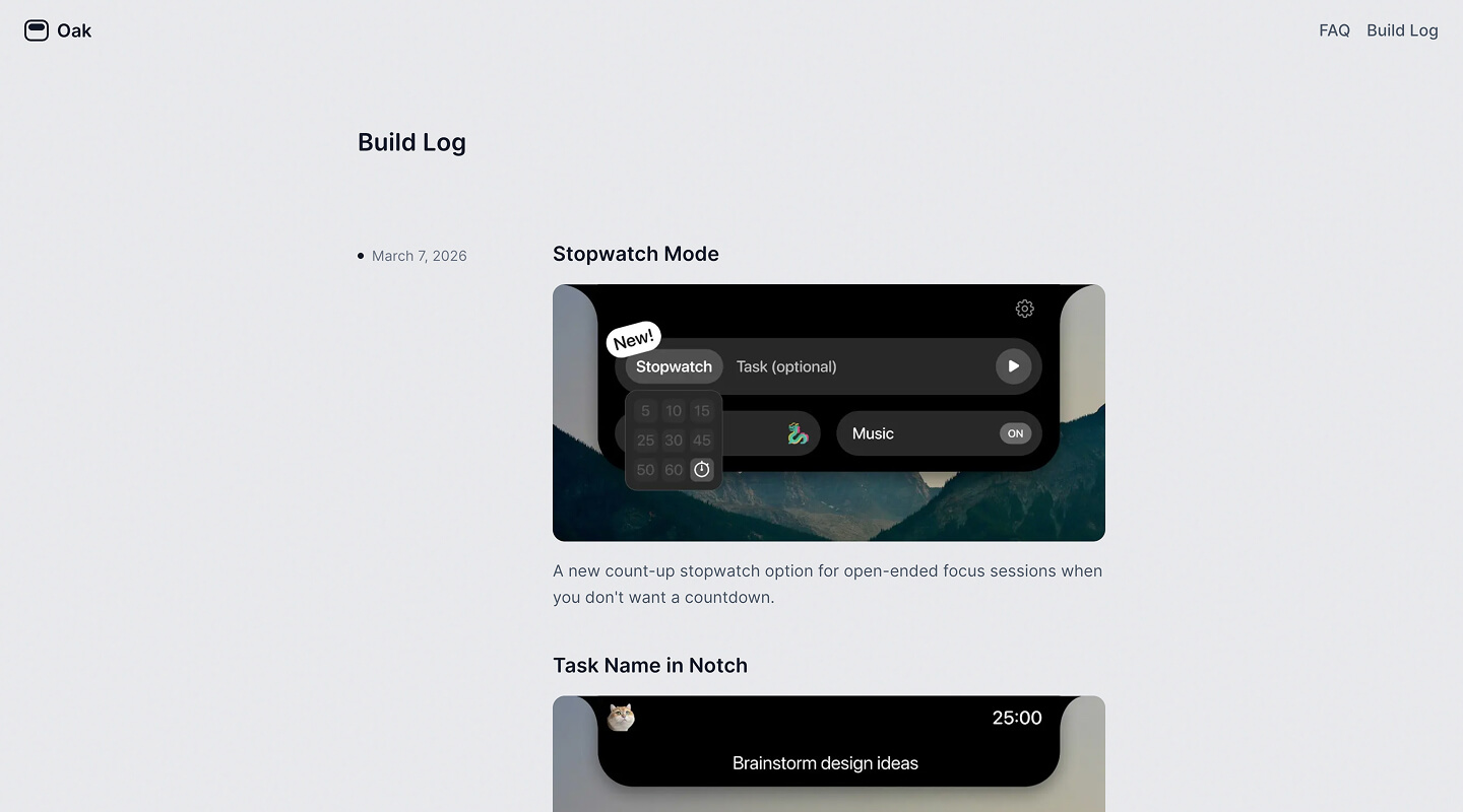
Build log
One of the pages I’ve always wanted to build was a build log. I’ve seen it in so many products, so I wanted to carry that spirit here to Oak.
Starting to market on Instagram
I’m also planning to expand to Instagram by recording my voice & creating some content. More on that in the future.
Looking back
Oak is undoubtedly my proudest side project. I touched every part of it — from backend decisions and design details, to analytics dashboards and marketing. I learned something from every single piece.
But my proudest moment isn’t any one feature. It’s that I built something people pay for.
For a complete stranger to find enough value in Oak to pay $4.99 — that’s an unbelievable feeling. Thank you to all 40+ of you who did.
Building Oak also changed how I see myself. As a designer, I no longer have to just design. I can build. I can think through backend decisions. I can own distribution. And I’m already working on new ideas and even starting to explore model fine-tuning. More on that soon.
It’s a genuinely exciting time to build. It’s harder than people make it sound — but if you push through, you’ll be surprised by how good it feels when something you made actually solves a problem or brings someone joy.
Newsletter
I share new posts, designs, and cool inspirations.